UT Digital Illustration
Wednesday, April 27, 2011
Monday, April 25, 2011
Monday, April 11, 2011
Thursday, April 7, 2011
images
I wanted to do more of an 'environmental' portrait.. hence the reason he's at caribou coffee in the picture.
I'm posting 5 for feedback on which one you think will work best.
Also, is it okay to stay pretty true to the background?
I'm posting 5 for feedback on which one you think will work best.
Also, is it okay to stay pretty true to the background?
Saturday, April 2, 2011
Thursday, March 31, 2011
For Photoshop Drawing

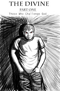
For my photoshop illustration I want to do a cover for my graphic novel that I'm going to be illustrating over the summer. The cover will display an image of the main character, with his hands outstretched in a crucifix like form, with stigmata like wounds. The wounds are meant to portray the character as a Christ like figure and let the viewer know that book has some spiritual and religious connotations. The character’s expression is meant to be devious and provoke feelings of mistrust and intrigue. The way I intend on constructing the image is by basing it off reference photos of myself in the pose wearing the same type of clothes that the character wears, and of a plain setting such as a brick wall or monochromatic background, so that all attention is paid to the character. And of course, I’ll put the title up at the top of the cover.
Subscribe to:
Comments (Atom)


